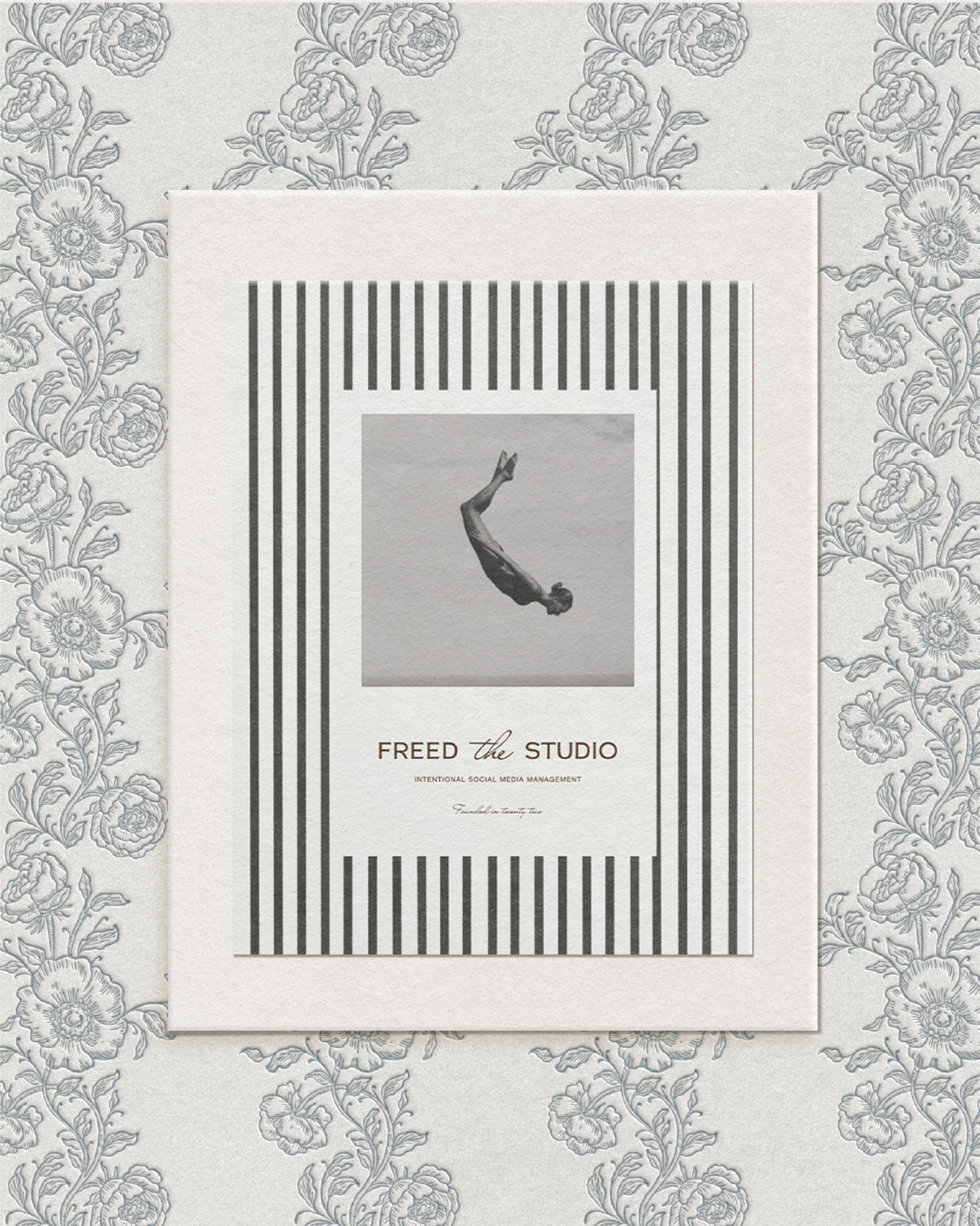
FREED THE STUDIO
Katie, the founder of Freed The Studio, came to me seeking a brand identity that felt aligned with her evolving vision — one rooted in creative freedom, clarity, and quiet luxury — but she was struggling to translate those values into a cohesive and elevated visual presence.
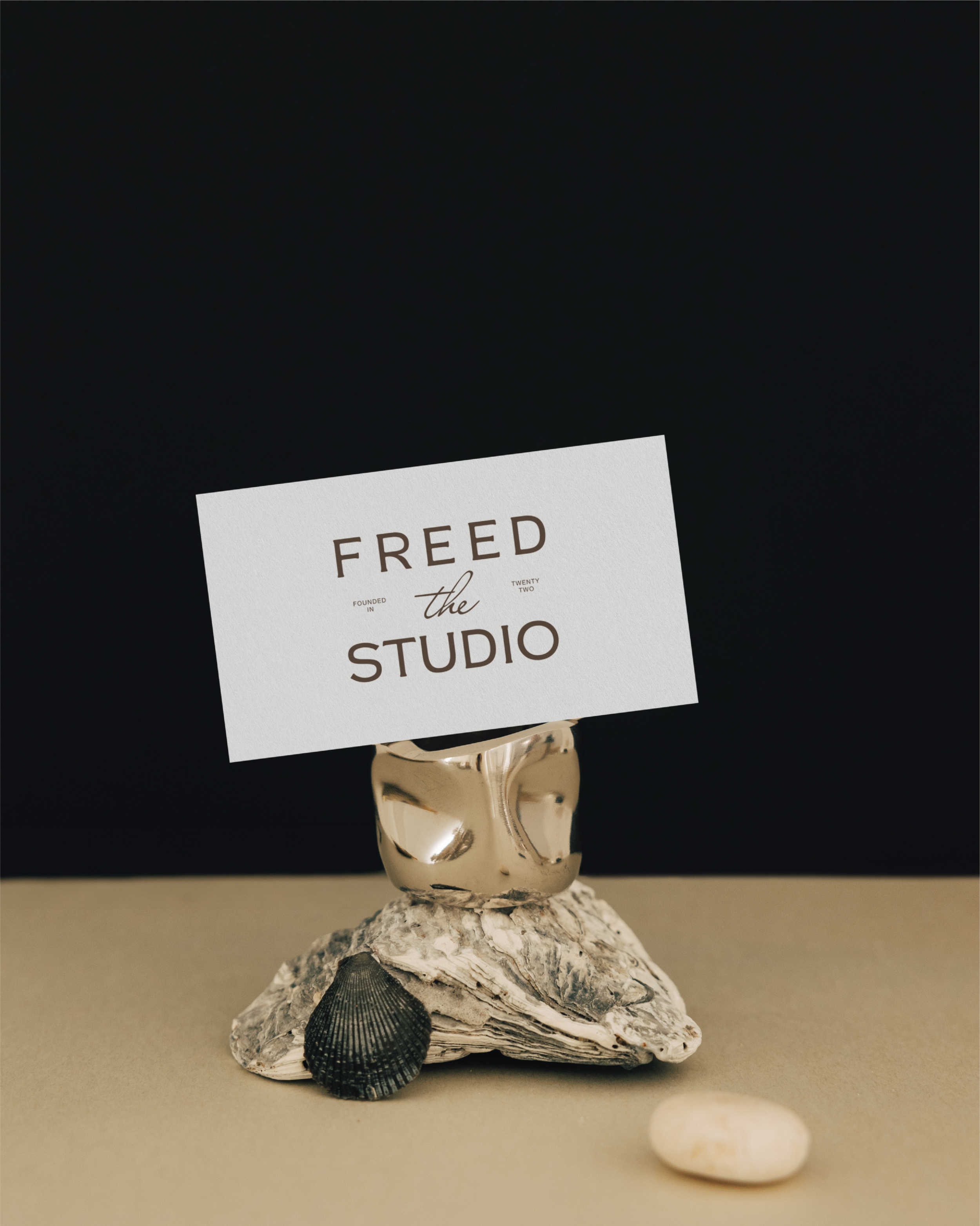
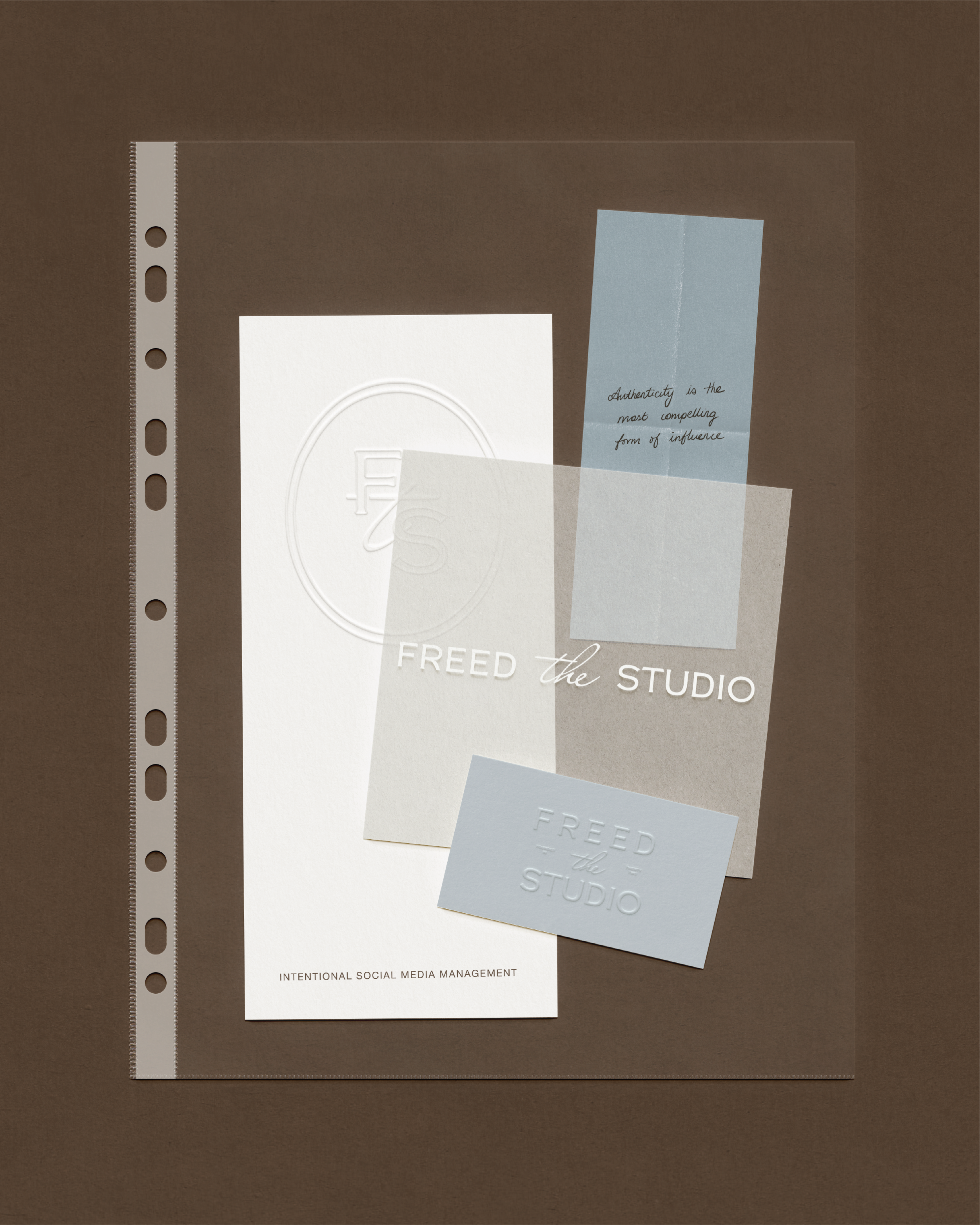
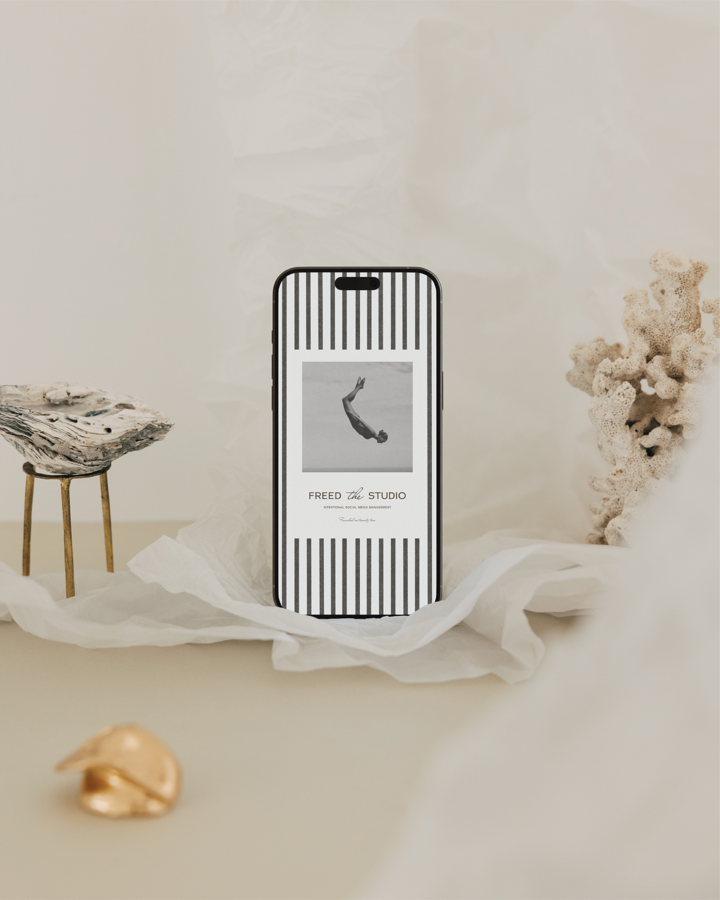
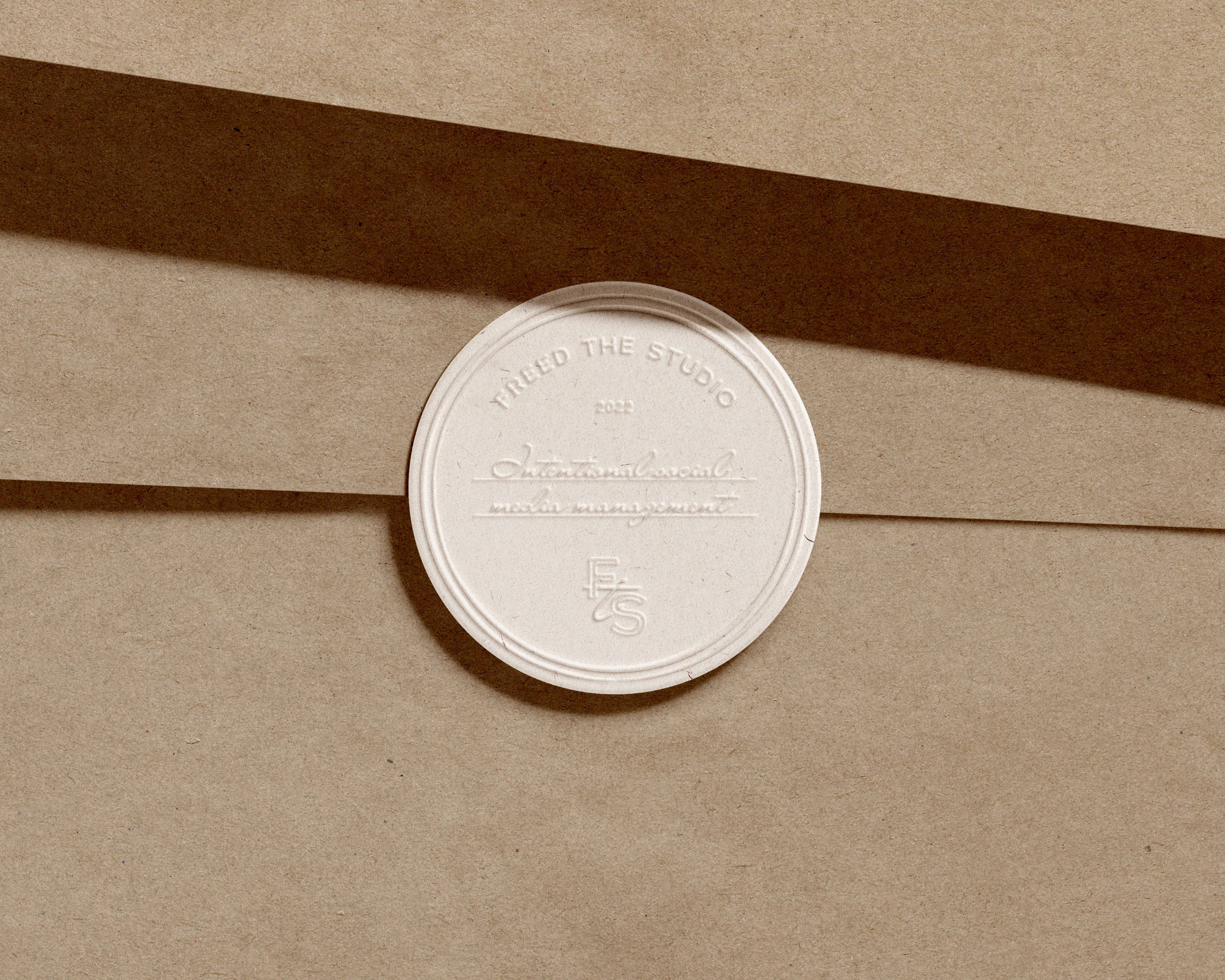
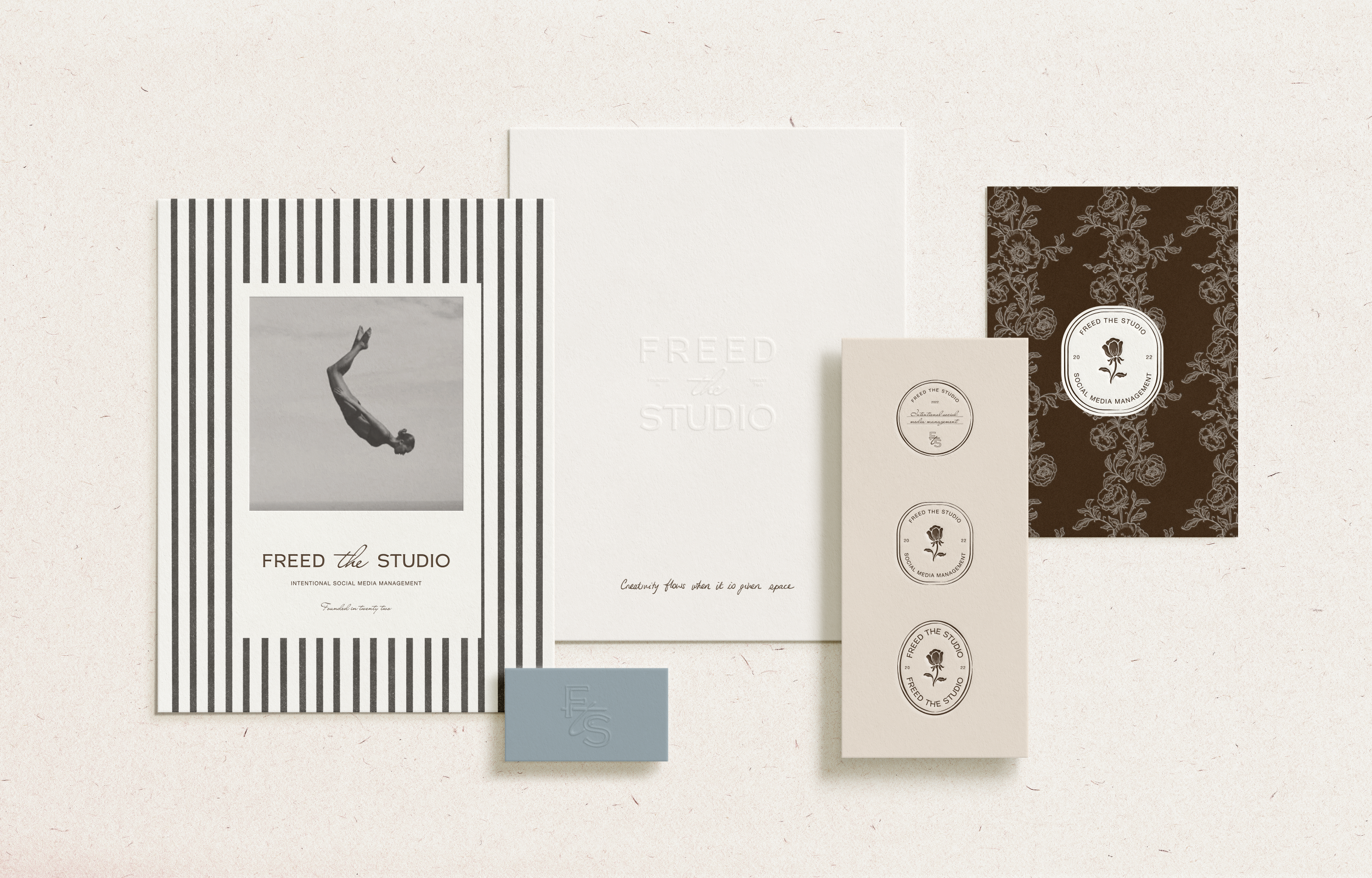
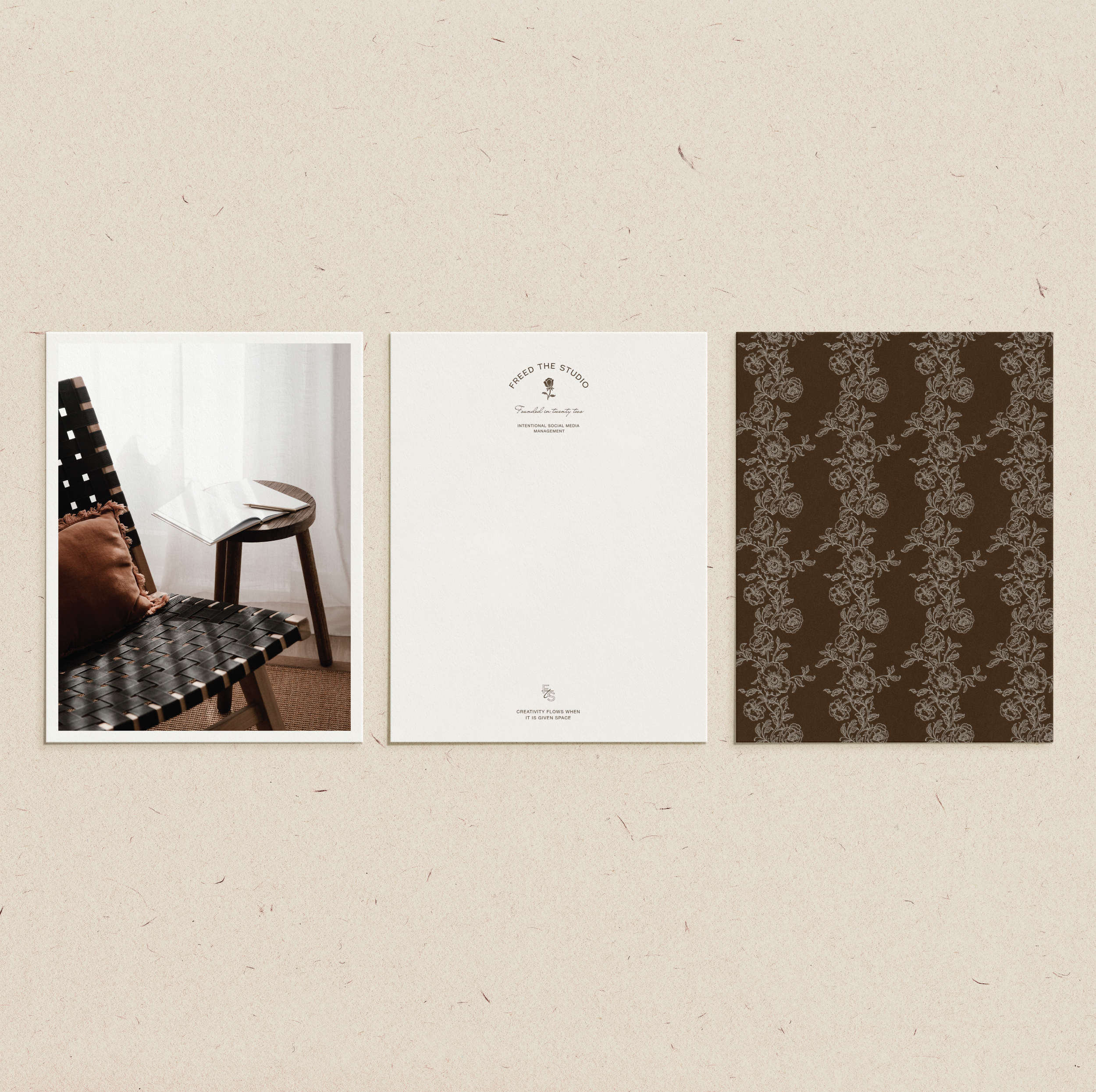
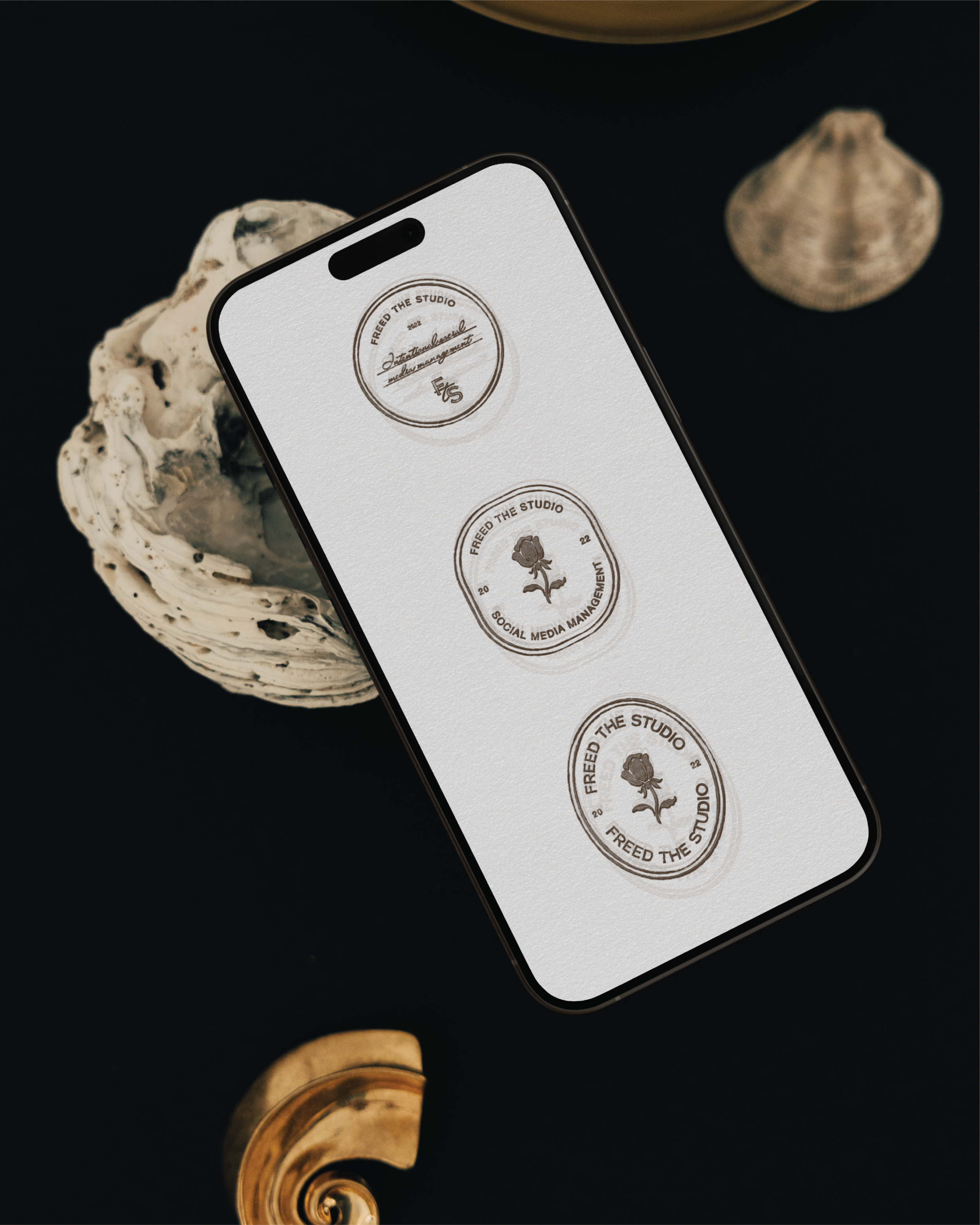
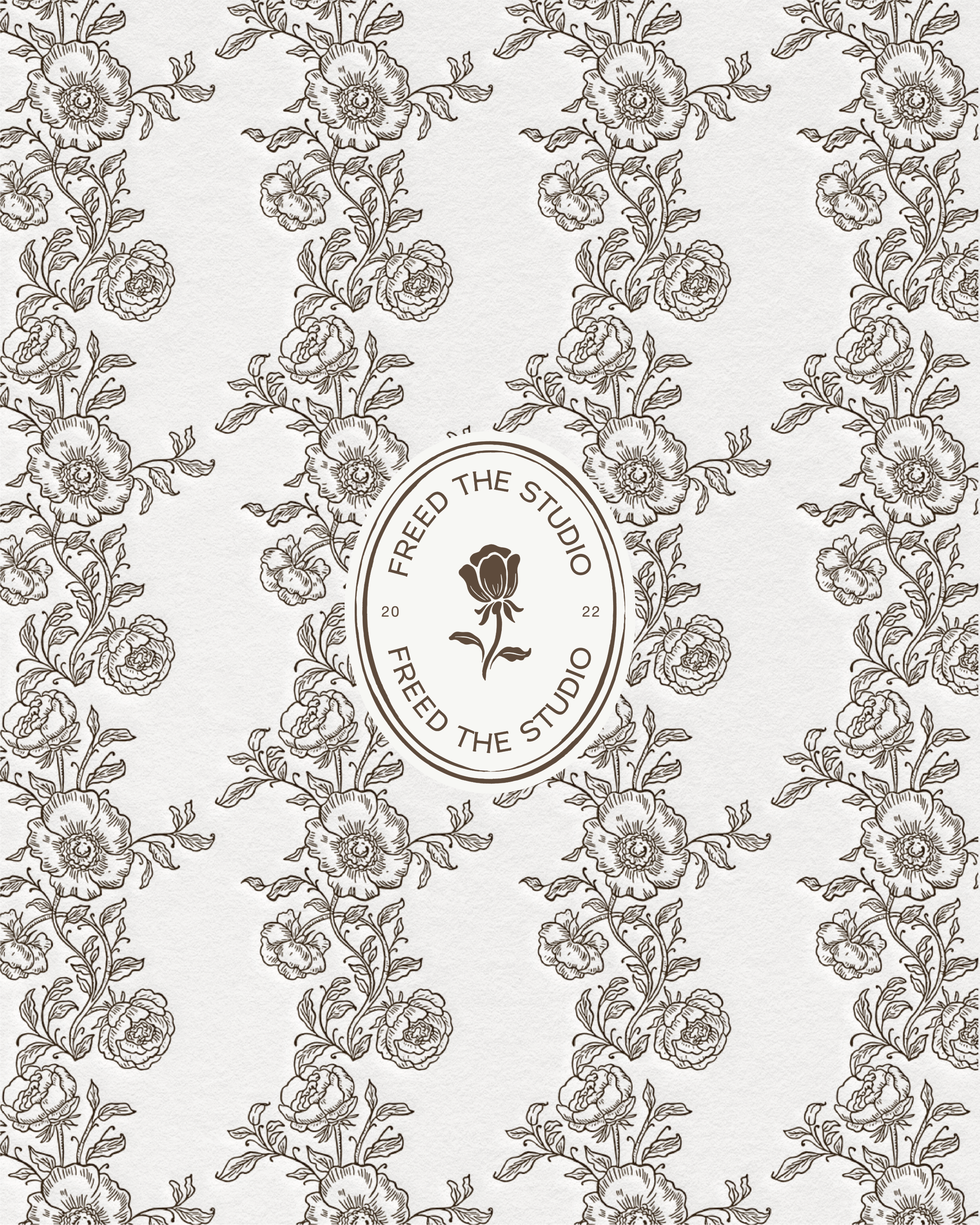
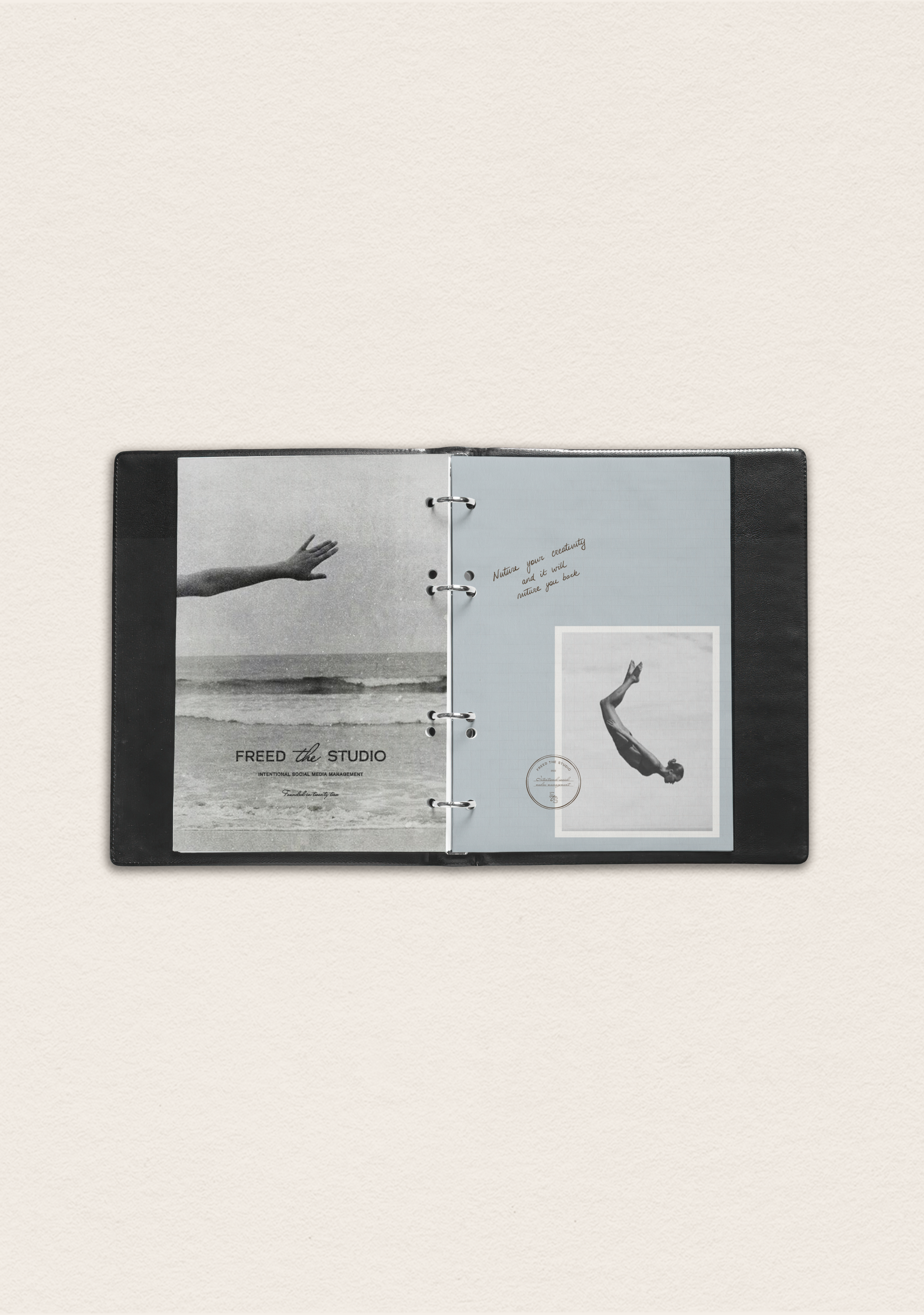
Together, we brought Freed to life through a considered, editorial brand identity featuring custom typography, a refined logo system, a meaningful brandmark, and hand-drawn nature-inspired illustrations. Every element was thoughtfully designed to reflect space, flow, and intention, supporting Katie’s long-term vision of building a luxury-led creative studio. The result is a calm, distinctive brand that allows Freed The Studio to show up with confidence and consistency across its website, social media, and digital touchpoints — elevated, expressive, and true to its foundations.
INTENTIONAL SOCIAL MEDIA MANAGEMENT
SCOPE OF WORK: BRANDING

KIND WORDS
Before Sandra started my branding, I couldn’t quite visualise everything that I was inspired by coming together, but Sandra told me that somehow she has a way of bringing all the pieces together in a cohesive way…and she did just that! The final branding felt more like what I wanted than I knew.
So much thought and detail went into the branding. One of my favourite parts was Sandra incorporating ‘established in Twenty Two’ into brandmarks. For context, I am also changing the name of my business whilst re-branding, and my previous name was ‘Twenty Two’. So now this is subtly incorporated into my new branding, honouring where I started.
And of course, one of most meaningful parts is Sandra’s hand-drawn elements..hand-written quotes, artwork, illustrations, and backgrounds. Sandra is incredibly talented, and her branding is art! So if you’d like an identity that is completely unique to you, and takes a personal approach, I would highly recommend Sunday Lane Studio 🤍
-KATIE CARTER, FREED THE STUDIO